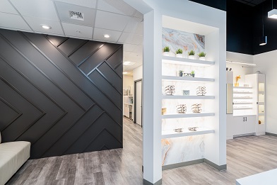
Since when does anyone know exactly what they want right from the get go?! We know it is easier said than done, so here are some quick tips on how to design your new space and have fun doing it!
1. Start with ideas of what you like and don’t like– To get an idea of how you want your space to look check out other offices in your area (optical as well as non-optical spaces like retail), flip through magazines, or browse company websites (especially the Ennco Display Group website ;)) – Shameless plug!
2. Be open to new ideas– The great thing about having an experienced designer at your side is… they have all kinds of ideas and could do this with their eyes closed! Although it might be hard, be open to what they have to say even if it is outside of your (cozy and warm) comfort zone.
3. Discuss the bottom line– Be prepared to discuss your budget. All too often unrealistic budgets can hamper great potential projects. We understand nobody likes to discuss the finances of design, but doing so will save you tons of time!
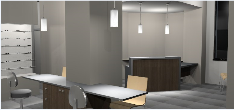
4. Take the plunge– Give your design team the green light on your office plan! If you need to first give them the yellow light that’s ok too… baby steps! The team will create a visual 3D model for you to fall in love with- if it’s not love at first sight don’t fret, changes can be made to make it a perfect match.
5. Practice Communication– The 3D model is a great way to see the many different store fixtures styles and colors that will create the overall feel to your space. Be honest and open with your designer, this will allow the design process to move smoothly and more efficiently.
Well now you know…these 5 steps are easy to follow and will ensure you are successful when creating your new space. Of course there is always the option of telling your designer to take the lead and just show you the final product!
Happy Designing!
ANSWERS TO YOUR FAQS!
All the time we are asked the all important question… “How do I get started with designing my optical space?!”. Well we thought it might be helpful to answer some frequently asked questions for you right here in our blog! Check out the answers from our CEO Jan Ennis.
What is the first step in getting started with determining the right design or atmosphere for ones’s optical?
This is a very broad question and one that is far less important in optometric practices than “proper layout and flow” for the entire practice. Optometry has changed in many ways in the last few years and the very first consideration to be given is the list of room requirements for the overall space. The areas of “pretest”, “special testing” and “fields” need to be given serious consideration for both room requirements and process flow. A well thought out professional space can eliminate the need to move later if sales volumes increase beyond initial expectations. While we still see people “remodel” their dispensaries, we too often see new practices that have been poorly laid out before we are ever contacted to assist. We are then given the task of making the optical space attractive and profitable while we see how money will be lost and space considerations for professional services have often been overlooked. It is very difficult (and time consuming) for us to then insert our professional experience into the process to help the client avoid potential space consideration problems in the future.
There are a number of companies specializing in optical design that take a far more holistic approach to design than simply putting the face on the dispensing area. As critical as that area is, it has to first create the professional image of the practice and then function as the “retail face” of the business. We typically design a practice such that there is never a “view” from the retail area to the “professional services” area. This allows the practice to function properly by not sending mixed signals to the patient about the market position of the goods or services being provided. It also allows the practitioner to move freely from room to room without distraction from the retail area.
The atmosphere for the dispensary works best if it is done in an approach that we call “professional commercial”. A space that is too retail looking or too extravagant looking can either overpower the presentation of the merchandise or it can diminish the value of the professional services that are being rendered. In order to help the client determine the atmosphere for a space, we like to understand the demographics of the practice, the type of location for the space, which direction it faces and also the other types of businesses in close proximity. Our clients operate in medical facilities, retail shopping centers, standalone buildings and malls. Each of these types of structures presents us with a different view on how we might direct a client’s approach.
While we have a number of clients that are extremely creative and lots of us have “DIY” desires, you can simply avoid some very costly mistakes by consulting and working with those of us in the industry that have tried numerous approaches to merchandising and found what does and does not work. We get many great ideas for new items from clients, but can also steer people away from ideas that did not really work as well as they “looked”.
What is the biggest mistake you’ve seen, in terms of budget?
Not having a proper budget is the single biggest mistake regarding budget that anyone can make. The second biggest mistake is thinking you can do it cheaper than people that do it professionally all the time. After 40+ years of manufacturing and construction experience, there are too many variables to define for someone to effectively work to an unrealistically low budget. Banks that do practice loans are a great source of “logical” information for construction and fixture budgets. They see the original budgets that loans were granted for and then have the data for the actual payments made. Construction costs are available in industry publications and can vary (+ or -) by region. We typically see that a properly designed practice in most areas of the country will cost between $105 and $115 per square foot to complete today. These costs represent the “Total Package” of general construction, store fixtures, seating, lighting, etc. Equipment and inventory are obviously separate portions of your overall budget and selection of premium finishes can obviously increase the square footage costs.
The budget discussion above simply sets the stage for the true requirements in order to produce a proper budget. A simple floor plan is an absolute joke for budgeting purposes. Far too often we see doctors get “complimentary” floor plans for a new space and then race off to do a budget. A floor plan has absolutely no consideration given to the single biggest component of “extra” costs….FINISHES. A floor plan does not specify floor coverings, paint colors, seating, lighting, casework finishes, HVAC (if needed), etc. I could not possibly tell you how important it is to define either (a) a maximum budget that drives these design considerations or (b) final decisions that are not restricted by budget to all have these things defined before you begin construction. One of the biggest killers of a good construction budget is not having ALL DECISIONS done prior to construction start. I have seen “change orders” add far too much cost to a great project because a client constantly changed their mind about small things once contractors started building. A well budgeted, fully planned space becomes a well-executed project. The only way I have seen this work well is when enough time is allocated to fully design the space for both retail and professional considerations, all the details of finishes are complete and enough time is given for any required permitting and general construction. Following this best practice will allow the practitioner to focus on their primary field of endeavor.
Did you have any more questions you needed answered? Send us a comment and we will write another post answering your questions!
DIY or DI-saster?
It’s all in the details! How many times have you walked into a space and the lighting wasn’t quite right or the carpet was a crazy shade of orange that did not compliment the walls. Many times, clinics fall prey to the idea “we can do it ourselves” or “I can find that on my own for cheaper”. Sometimes the added stress and energy needed to “DIY” just doesn’t pay off. Our advice… find a company that can do it all for you while keeping you involved in the process step by step.
We have developed our Total Package Architectural Design with that idea in mind. We want you to be involved every step of the way, from finalizing the layout and flow of your space to picking the color and style of the lounge chair in your waiting room. Every client has a different expectation of the level of involvement they have in their clinic build out or remodel. We have worked with clients who work with us to pick out every detail, and we have clients who show us one picture and tell us to “run with it” to pick out each detail for them. We enjoy working with both types of clients…it makes our job fun!
We work with you to learn your likes and dislikes, then from there create a cohesive design plan for your entire space! In the process we provide you with an array of color samples, design layouts, and fixtures then you pick your favorites! You make all the final decisions and we take on all the work of sourcing the products and getting you the best possible price.
Avoid the mistake of trying to do it all yourself. You have enough going on in your daily business, trust this to the pros.
Things to consider when renovating or starting a new practice!
Maximizing the space that you rent or own is one of the most important things you can do to keep your practice running efficiently. Using every square inch at your disposal can be the difference between a standard year and setting your sales record. There are multiple things to consider when you are starting new or renovating an existing practice. The helpful guide below can give you some important things to think about.
What would your clients like?
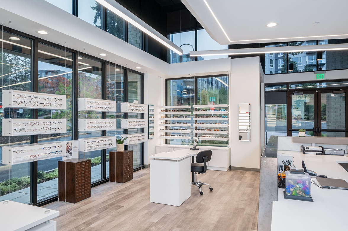
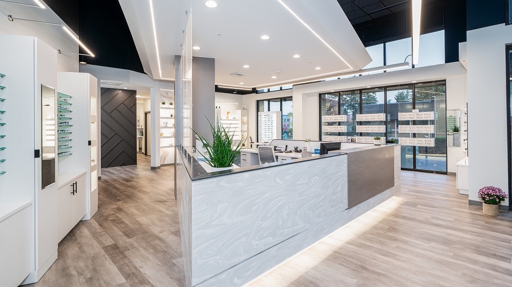
An important thing to consider when setting up or renovating a practice is the style and aesthetic of the space. You want it to be inviting but you also want to keep a professional look to it. When it comes down to it ask yourself one question: What kind of feeling do you want your customer to experience when they walk in the door? There are many styles to choose from, ranging from modern metals and greys to the classic woodgrain look. Knowing your client base becomes important in this situation because different demographics feel more comfortable in different kinds of spaces.
Location, Location, Location
The location of your practice also plays a role in what the best design for you is. You want to stand out from other buildings and practices, but you don’t want to seem like an eyesore if your store looks significantly different than all those around you. Sticking to your brand and being aware of your surroundings are important things to consider when renovating or creating a new practice. When working with a new space always consider how things will flow through your store as well as how they look. Your displays can be top-notch but if your clients cannot access them, they might as well not be there. We created our Floor Plan and Space Evaluation Package to help with that exact thing! Seeing how your space will flow before committing to your layout is a necessary step!
Making sure YOU love your space
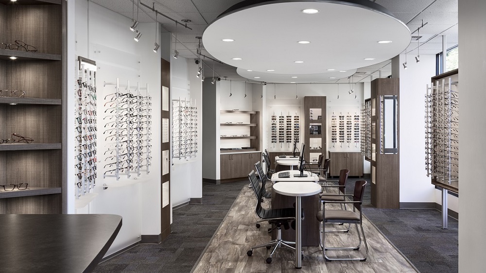
Really one of the most important parts about the look of your practice is how much you love it and how much you enjoy it. Remember you and your staff will be spending the most time in your space, so create a space that you want to be in and you feel comfortable in. Ask yourself: What kind of optical do I want to have? There are a variety of styles and layouts to choose from, take a look at some of our latest projects for inspiration. Open styles, boutique styles, and retail specific are among the most common; but each of these can be molded and shaped into exactly what you are looking for.
Overall, you want your space to work for you and your clients. Finding a nice balance when it comes to these topics is key to having your practice run smoothly and efficiently. If you are considering renovating your existing space or creating one from scratch, we can help you with every step of the design and build process. Give us a call today to get set up with one of our designers. 425-883-1650
When is the right time to upgrade or remodel your dispensary?
Today we will discuss some of the signs your practice may need an upgrade, and what you can do get that process started.
Age of your displays:
Are you displays staring to look worn out? If you can notice, so can your customers. Keeping your displays looking updated and fresh not only helps you retain customers, but it can also help you make sales. If your frame comes directly off a nice-looking display your client will know you take good care of it and it is a valuable item. If it comes off a worn out and broken display your client is less likely to think the value on the tag matches the value of the frame.
Quality of your displays:
The quality of your displays is an important thing to consider. It’s important to have displays that compliment and allow your frames to stand out. If you have a dispensary where you want clients to browse accessibility is also important. Sometimes a simple solution is the best solution. You don’t always need the large overbearing displays to catch people’s attention. Let your frames do that! We have multiple wall panel solutions that give you a simple yet elegant and accessible display for your frames.
Break-ins can have a big impact on your yearly sales goals and are a pain to deal with. Theft deterrents and locking displays are a great way to keep your inventory safe and reduce the need to bring frames into a locked back room every night. We have some great locking solutions that can keep your frames safe and looking great.
Number of frames you can display:
Displaying all the frame lines you want to can be the difference between making a sale and losing another client to online retailers. The number of frames you display should reflect your main client base and what lines of frames they would like to see. We can help you maximize your space with wall displays and countertop displays.
If you see your displays lacking in 2 or more of these categories it might be time to consider a practice remodel. A practice remodel can be a daunting task, but we are here to help. We have multiple resources for you to start the process including a Free Dispensary layout service.