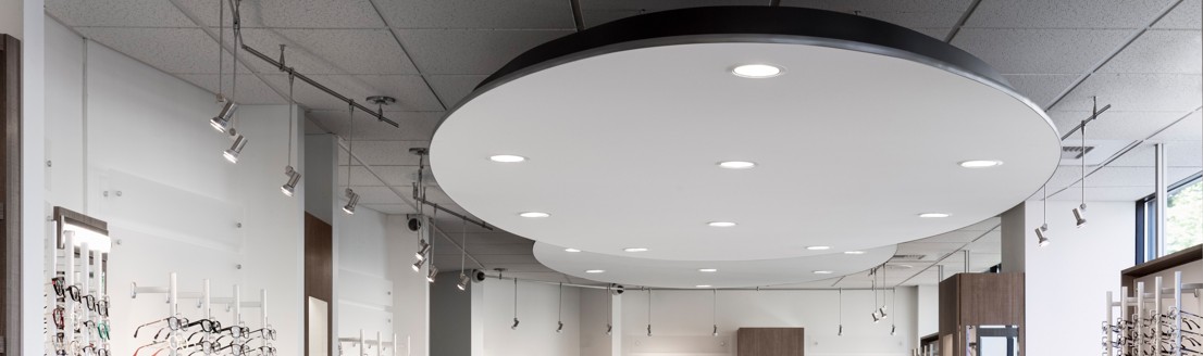
Lighting is a critical element of store design and merchandising and is far more technical in nature than many people consider. After years of studying and experimenting with lighting and lighting techniques, I have yet to see a perfect scenario. The advent of LED lighting has certainly given store and store fixture designers many more opportunities to create engaging lighting for all types of merchandise.
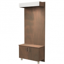
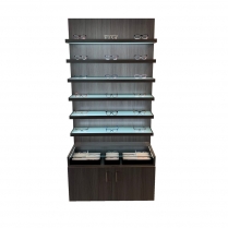
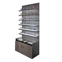
A space with merchandise requires multiple types of lighting and for purposes of this blog, we will not include indirect sunlight. The space needs ambient lighting (ceiling), direct merchandise lighting and possibly indirect theme lighting for graphics or signage. Within the ambient lighting, there are differing needs between reception, retail area and professional services area that includes exam rooms and testing. Direct merchandising can include lighting that is built into the store fixtures or added to the ceiling lighting directed to the merchandise below. This latter scenario does require significant thought to address ceiling height and beam spread to get the lighting desired at the distance from the source. As for graphics and signage lighting, a determination needs to be made whether the illumination needs to be 24/7 or simply during business hours. This determination guides the selection of lighting and power.
As we focus away from ambient lighting and move to display lighting, there is one significant decision to make and that is the “color” of the lighting to be used for the space. We are all familiar with ROYGBIV as it relates to light and color. As LED was introduced and grew in use, people became more familiar with the difference between “soft white” and “bright white” light. Lighting color is measured in Kelvin temperature. 2700K is considered soft white as the light contains tones of red/yellow. 5000K is considered bright white and is at the other end of the light spectrum closer to blue. This is where the author of this article feels compelled to share that color sensitive people see the color of the merchandise “on them” as a more true color at 2700K. However, the article is titled “How Lighting Impacts…” and the most prestigious large retailers have found that either 3500K or 4000K makes merchandise “pop” versus the lower spectrum. In the spectrum described above, the color is neither red/yellow or blue.
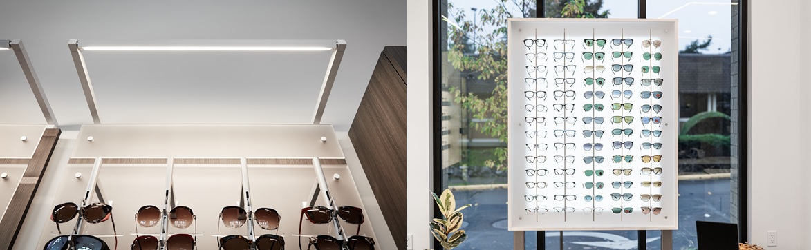 It is not required that the ambient lighting in your space match the lighting in the displays, but it eliminates any distraction between the “color differences” that can occur in the lighting. If you can “pair” the color of your ambient lighting to the color of the fixtures, it will create a much more dynamic look and will brighten your space.
.jpg)